The 100-Year Life Health Education and Government

How do you visualise an unfamiliar part of the British political process?
That’s the question we asked ourselves when we began this project. Answering it came down to the medium as well as the message – and when it came to design, familiarity was at the heart of what we wanted to build.
Many of our early ideas involved some sort of game. In order to stick, it needed to involve an element of fun. We went from Monopoly to Game of Life (real family staples) until finally settling on chess. It was the obvious choice in the end: a game of kings and queens, power and strategy, opposing sides. It has an archaic, timeless quality (and both chess and the House of Lords have bishops).
From the start, we knew this project would be composed of two parts. First, we needed a step-by-step introduction to what the House of Lords is, how it functions and who works there. To do this we wanted to take people on a journey through the types of peers found in the chamber, before being presented with an interactive tool so the user can explore further.
The initial level would be the chess pieces, which would represent an ‘archetype’ of a peer in the House of Lords. These would be assigned based on their voting records and activity within the chamber. The data team analysed trends and attributes, and began creating groups. We went through various names, eventually settling on a set of 11.
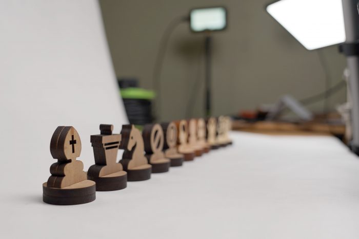
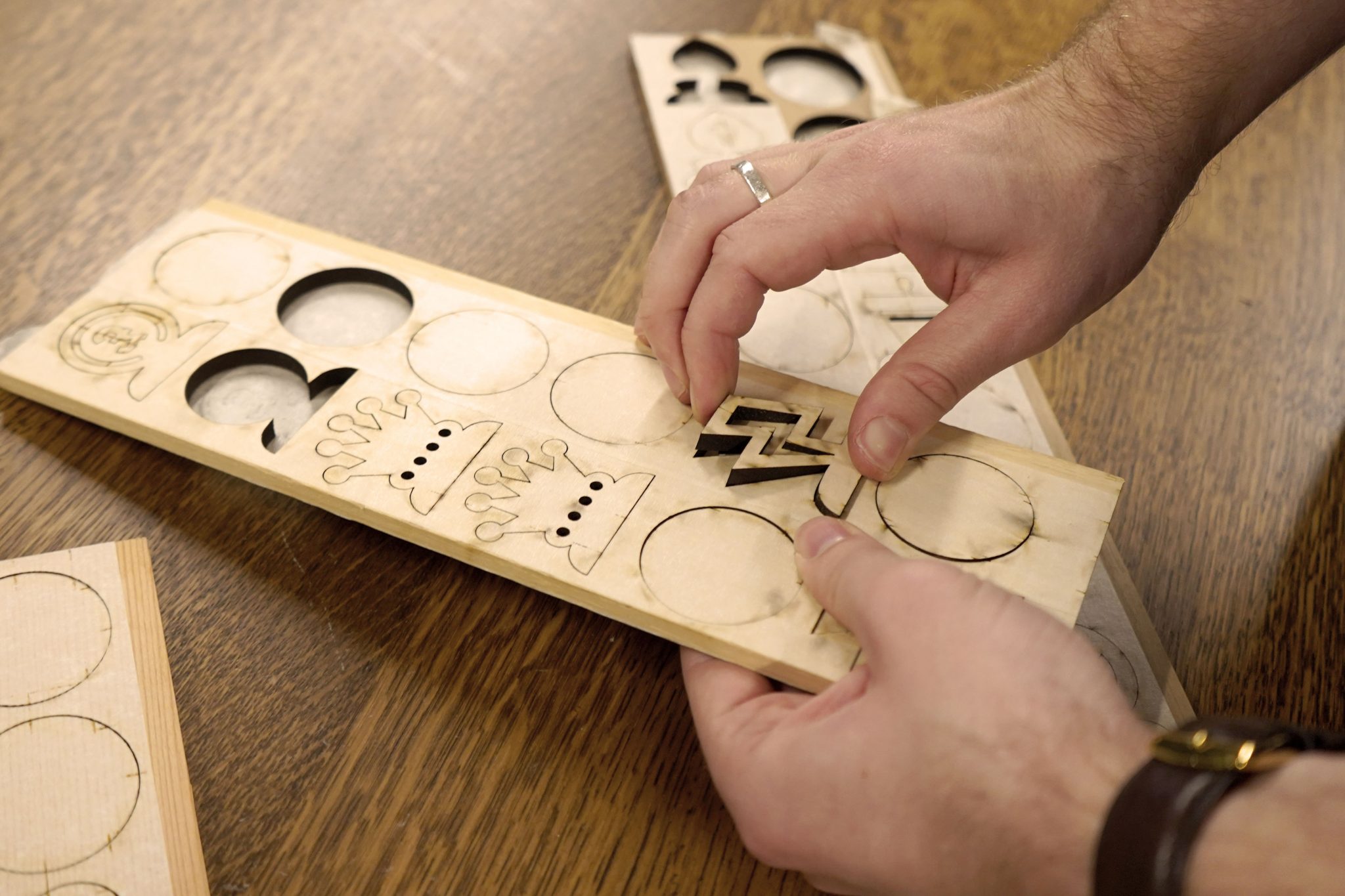
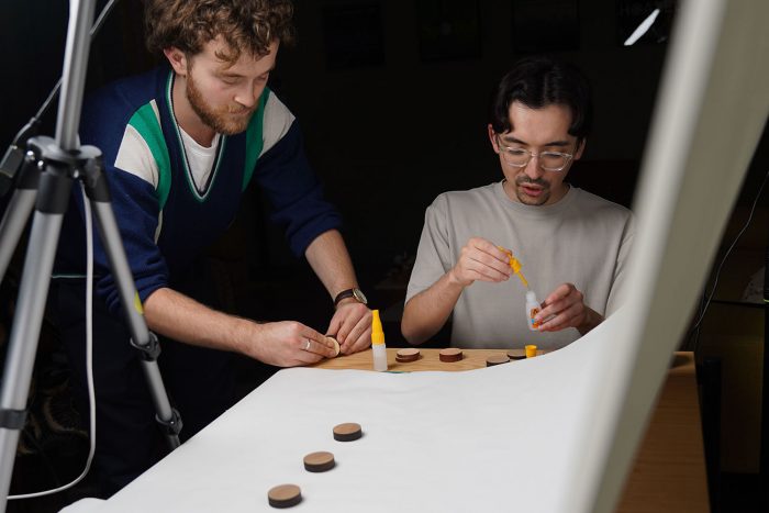
Then came the challenge of how to represent these. What does a ‘rebel’ look like? And how do you make these archetypes distinct from each other, recognisable at small scales, and still feel like they belong in a chess set? We tried a number of variants, and tested within the team what icon looked most entertaining while being clear. Once we were happy with each chess piece silhouette, we looked into how these would be constructed. After testing 3D printing methods and laser cutting, we decided on the latter for its ability to work with wood, giving the pieces a more traditional feel.
The explore tool was developed in tandem with the physical process of creating the chess pieces. The idea was to review and compare attributes such as age, contributions, gender and party. These would be reviewed using a set of filters the user can toggle between. You can also dig deeper into information on each of the peers within a contextual drawer containing information on financial interests like holdings and employment history. The usability of the tool had to involve familiar behaviour, and I used wayfinding apps like Google Maps as inspiration for the interface.
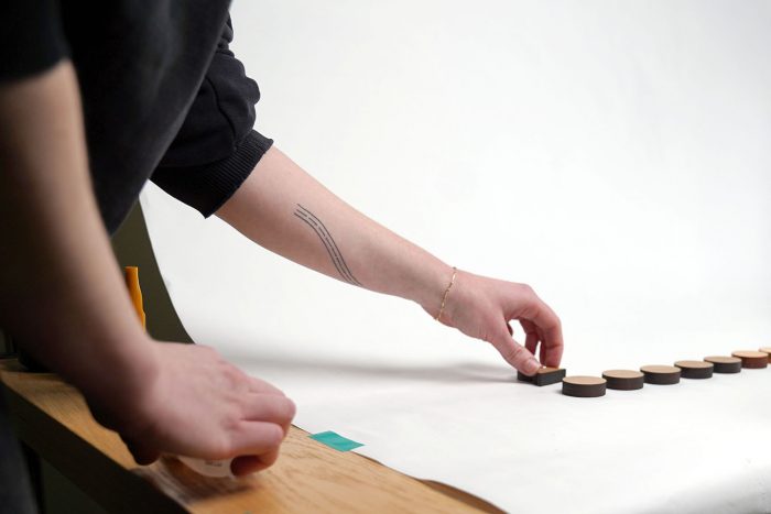
Once we had an idea for how the explore tool would function and what it would show, we then began storyboarding the introductory piece. After testing a few shots, we then began the painstaking process of animating the pieces. We tried to give each piece its own character; ‘blockers’ moved rigidly, ‘rebels’ frenetically, and ‘ghosts’ hovered ghoulishly in the air. Hands were used in some of the shots to show scale and give a personal touch. After all, the charm of this project lay in its tactility.
Following shooting, editing and colour correcting the short film, we then stitched together each clip into an interactive ‘scrolly-telling’ journey. Each text box would trigger a related video, allowing the viewer to be guided through our process at their own pace.
I hope this project offers an insight into how the House of Lords operates and allows people to make their own conclusions on the mechanisms behind the power structures in play in our country. Click here to find out more about the archetypes in our short film, or jump in and start exploring the tool.
Credits:
Data and visual storytelling – Katie Riley
Data scientist – Joe White
Design and directing – Oscar Ingham
Photography – Tomini Babs
Product development – Chris Newell and Will Jarrett
Data researcher – Bex Sander
Creative director – Jon Hill
Colourist – Misha Kim
Laser cutting – Cut Laser Cut
Supported by the Open Society Foundations.