An alternative tube map has gone viral by daring to show the original no longer works.
The London Underground map seems irreplaceable. In 2006, it was voted one of the UK’s favourite designs of the last century, alongside the Spitfire and Concorde. It’s immediately recognisable and lucratively brandable.
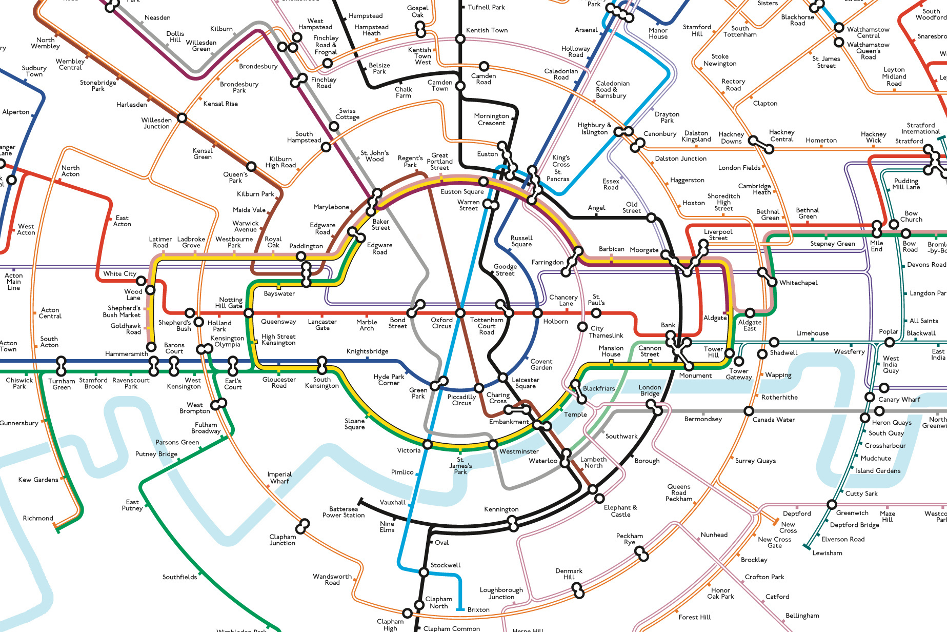
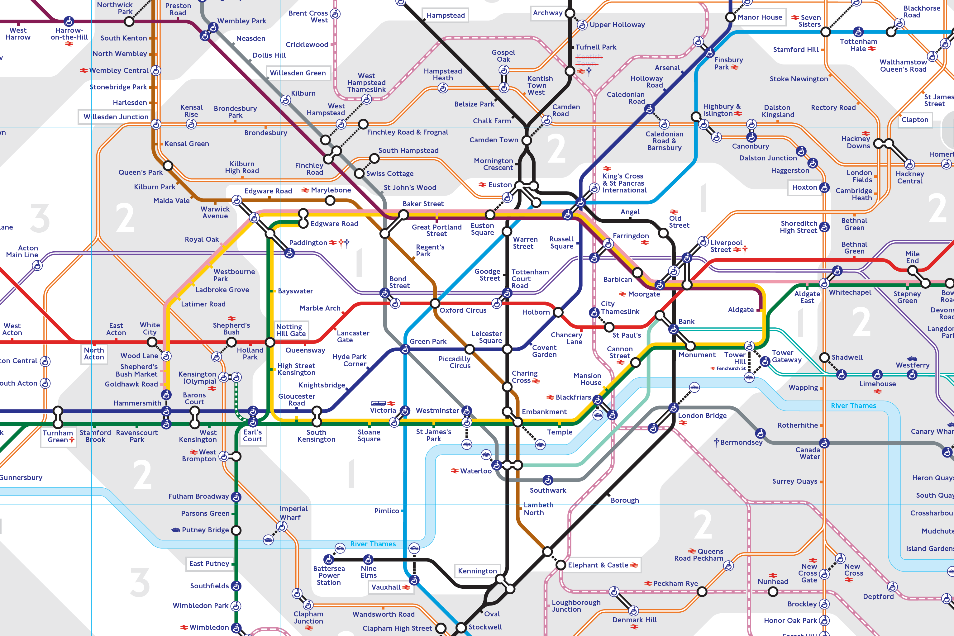
So what? It’s also close to useless. In its current form, Transport for London’s (TfL) version of the Tube map has acquired so much detail that finding out how to get from A to B is no longer simple, which is a map’s death warrant.
Low-lights include:
- a tangled mess of lines, stations and connector blobs around Liverpool Street, Moorgate, Bank and Monument;
- Paddington, whose name label is so far away from the Bakerloo line that it’s unclear the station is even on it, and;
- the lines themselves, which vary from block colours to double-lines, triple-lines and dashed-lines. Only a local would know why.
It has led some to ask if it’s time for a radical redesign.
Off the rails. This month, the latest version of an alternative map designed by Maxwell Roberts, a lecturer at the University of Essex, has gone viral online, with more than a million views on X. Its circular diagram places Oxford Circus at the centre of the network and claims to better reflect the geography of the city. Many agree.
Roberts sees his work as a form of “exploration” – to see what’s possible 90 years after the classic Tube map first appeared.
Simply the Beck. Harry Beck’s 1931 diagrammatic map established a mission statement that made it a gold standard: usefulness over accuracy. Methods to achieve this included:
- Inventive spacing: Leicester Square and Covent Garden (300m apart) appear as far apart as Highgate and Tufnell Park (2.4km apart). Because if you’re on a train, one stop is one stop.
- Strict angles: lines only changed directions at 45 and 90 degree angles. Plotting their routes more accurately would see them become untidy and difficult to follow (see: the 1921 edition).
- Functional fonts: san-serif and clear, with station names only; clear to the reader and with no superfluous information.
Roberts’ latest design shares a lot with Beck’s. There’s more room to breathe and clearer routes, while maintaining established colours and fonts. (Playfully, it also hides the iconic London Underground roundel within the Circle Line). Simply put, it’s a better map.
Information station. But Beck only had eight tube lines (and a river) to display. And even though Roberts’ design includes all modern services, it ignores the sheer wealth of information the modern London Underground map boasts.
Beyond lines and stations, TfL’s current version shows:
- Fare zones
- Sub 10-minute walks between two stations
- National rail connections
- Non-rail transport hubs (including Victoria coach station, riverboat piers, airports and the cross-Thames gondola)
- Stations with step-free access
- Train lines with air conditioning
- Stations undergoing temporary service alterations
Too much? Probably. But each is undoubtedly useful to someone. To reduce the map once more to simple lines and stations would be misguided. Taking elements off can cause upset too; TfL removed the fare zones and River Thames in 2009 but both were back by 2010. The map’s priority isn’t journey-planning anymore, which is more easily done with a phone. It’s more like TfL's shop window.
Ticket to cash. Last year, IKEA logos appeared on the map by the names of stations closest to their shops. Why? Money. Since Theresa May’s government removed TfL's £700 million annual operating grant, it’s been strapped for cash. That has led to unpopular advertising that can confuse passengers, and lucrative licensing of the map itself.
As Roberts’ new design went viral, officials at TfL were asked if they would consider a change. They said no, adding that the current map is “an iconic piece of world-renowned design.”
Maybe the real reason TfL will probably never redesign the core of Beck’s map is as simple as that. It’s beloved, and bankable. It’s London’s logo.